You are halfway down a good article when a window slams over the page.

You came to read about weight loss tips. The window wants your email address for something unrelated. The close button is tiny and pale grey. When you find it at last, a second window opens.
You leave. You never come back.
That story is why most people say they hate popups, and why many site owners skip them. Here is the surprising part: a helpful popup is one of the quietest ways to grow your email list, and your visitors can welcome it.
The gap between the two comes down to four choices you make before the window ever appears. Get them right and the popup feels like a friendly offer at the right moment. Get them wrong and you lose the reader who just found you.
Here are those four choices, in plain steps you can use this week.
Why Most Popups Send Readers Away
Think of the last popup that annoyed you. It broke at least one of four simple rules.
It appeared twice on the same page. Or it spawned a new window each time you closed it. Or it would not close at all. Or the close button hid behind a tiny, pale cross.
Each habit tells your reader one thing: you care more about their email address than their time.
Each rule protects your visitor in a different way. One popup per page keeps the screen calm. A window that closes once stays closed. A close button in plain sight gives your visitor control. A visitor who feels in control stays on your page.
A visitor who closes a window in anger seldom returns. Your writing and your traffic brought that person to your page. One bad popup throws that visit away.
So the first step costs you nothing. Drop all four habits. Show one popup per page. Let it close on the first click. Make the close button easy to see. Never open a new window when the old one shuts.
Before you switch any popup on, ask one question. Would I welcome this if I were reading this page? If the answer is no, change it.
Your goal is a helpful popup that offers something good. The best popup feels like a friendly offer, not an interruption. Your visitor should welcome the window, not run from it.
The best popup feels like a friendly offer, not an interruption.
Match The Popup To The Page Just Read
Here is the idea that matters most. Tie the popup to the content your visitor was just viewing.
Say your reader is on an article about weight loss tips. Your popup offers more weight loss tips, as a free report plus your newsletter. The reader came for tips, so the offer feels like the natural next page.
Now say your visitor is reading a sales page about dog training. Your popup offers a free dog training video, or a discount on the product they were just viewing.
A generic window that says join my newsletter ignores why your visitor came. A matched window says: you liked this, so here is more.
Keep the popup short. Write a headline, a handful of benefits, and one button that names what your visitor receives.
Here is a sample for the weight loss article. The headline reads: Want More Weight Loss Tips Like These? Three benefits sit underneath: easy meal ideas, a one-page shopping list, and a fresh tip each week. The button reads: Send Me The Free Report.
Notice what the button does. It tells your visitor what they get. A bare Subscribe button leaves them guessing.
If you have one free gift for your whole site, make two or three versions of the popup. Each version points to the page it sits on.
Decide What To Offer Inside The Window
A matched popup needs a matched gift. The gift is the reason your visitor says yes.
A short free report works well, as in the weight loss example. A free video works well too, as in the dog training example. A discount on the product your visitor was just viewing gives a buyer one more reason to say yes.
Pick a gift your visitor can use in minutes. A short report beats a long course here. Your visitor wants a quick win, and a quick win makes your next email welcome.
Say your page is about organic gardening. A one-page planting calendar fits that page. A general business checklist does not. Match the gift to the reader on the page, and the popup stops feeling like an interruption.
Pick The Right Moment To Appear
You have three timing options. The popup can appear the second someone lands. It can appear after a delay, such as 30 seconds. Or it can appear on exit, when the visitor moves to leave.
Skip the first option. Your visitor has not read a word yet. They close the window fast, often without a glance at what it says.
A short delay gives your reader time to settle in and see what your page offers. It suits blog articles well.
An exit popup suits a sales page. The page stays focused on the purchase. If a visitor leaves without buying, the popup offers a free gift so you can stay in touch. You lose nothing by asking at that moment.
Match the moment to the page. A reader deep in a long article needs time before any offer makes sense. A buyer on a sales page needs room to decide. Each page tells you when to speak.
You will find more list-building ideas in other posts I have shared recently. Each one follows the same rule: help first, ask second.
Choose A Look That Fits Your Visitor
Next, pick how the popup looks. You have three common choices.
A lightbox dims the main screen and fills most of it, so your visitor cannot miss it. A regular popup is a smaller window that sits over the page. A slider glides in from the top, bottom or side. It looks different from most popups, so it catches the eye.
Whichever look you pick, make it easy to close.
Here is a quick check before you publish. Open your page on a phone and on a laptop. Close the popup. If that takes more than one tap or click, fix it.
I have used popups across more than 100 websites, and I still cannot tell you which look wins for your audience. Your own visitors will tell you, and the next step shows you how.
Test One Change At A Time
You only know what helps your sign-ups when you track and test. Four parts of your popup are worth testing.
First, the copy: the headline, the benefits and the button. Second, the design inside the window, such as font, colors and images. Third, the free gift you offer, which can change with the page. Fourth, how and where the popup appears.
Change one part at a time. Compare two headlines, for example: Want More Weight Loss Tips? against Get The Free Weight Loss Report. Give each version enough visitors to show a clear result. Keep the winner, then test the next part.
Even when a popup does well, test it. A small change can lift your sign-ups further.
Check that your popup tool includes tracking. If it does not, you are guessing, and guessing costs you subscribers.
Keep a simple note for each test: the date, the change and the result. After a month you hold a clear record of what your visitors like, and you stop guessing.
Here is a simple rhythm to follow. Test the headline in week one, the timing in week two, the free gift in week three and the look in week four.
Your Four-Step Plan For This Week
Use these four steps in order.
Step one: choose a free gift that matches your busiest page.
Step two: write the short copy, with a headline, a few benefits and one clear button.
Step three: set the timing and the look. Choose a delay for articles and an exit popup for sales pages.
Step four: track the result and test one change.
Start small. One page is enough to learn from, and you can copy what works to the next page. Your best-read page makes the best first test.
That is the whole plan. One popup, one page, one matched offer.
Where A Helpful Popup Leads Next
A helpful popup opens the front door of your list. The next question is what your new subscriber finds on the other side. A warm welcome turns a sign-up into a reader. Silence turns it into a stranger.
That is where The Lazy Way To Email Riches picks up. It shows you how to set the right expectations on your sign-up page. It shows you how to write the welcome email that delivers your free gift the moment someone confirms. And it shows you how to build a list that sees you as a welcome guest. Your popup earns the sign-up. These steps keep your new subscriber reading.
If you want to go further, the full details are at LazyWayToEmailRiches.com.
You do not need a bigger site or a clever design. You need one popup that treats your visitor like a guest. Pick the page that draws the most readers, match the gift to it, and watch what happens to your sign-ups. A small, kind change often brings the biggest gain.
I am rooting for you.
Nick James
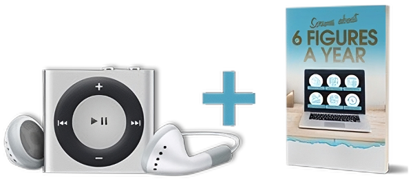
Claim Your Free MP3 And PDF Training: The 3-Part Plan To Topping $100,000 Per Year In Profit
Enter your name and email address below to receive a new lesson delivered to your inbox once a week. Your first lesson will be delivered immediately.
Privacy Policy : We value your privacy. You can unsubscribe from receiving future emails with 1 click at any time.